

Explore the refreshed Binance.US app, designed to help you do more with your crypto. Tour the latest improvements and try it today on the App Store & Google Play.
Today, we're excited to unveil a fresh new look for the Binance.US app, with a reimagined experience that makes it even easier for customers to navigate the world of crypto. The latest update, now available on the App Store and Google Play, brings thoughtful enhancements to the pages you use most — from the home screen that greets you to a personalized Portfolio page that helps you manage your crypto.
In the coming weeks and months, we’ll release additional improvements and updates that will transform nearly every page of the app. In this blog, we’ll take you on a tour of the redesign, reveal our behind-the-scenes design story, and share a sneak peek at the exciting changes coming your way.
Start with a goal in mind, then work backwards
At Binance.US, we’re constantly working to build a more seamless, intuitive, and consistent experience — one that enables our customers to access crypto with confidence. “We wanted to build an experience that leveraged the strengths and familiarity of the Binance.US brand, while creating a distinctive customer-focused expression that continually builds trust through every interaction and transaction,” said Jesse Spink, Senior Director of Design at Binance.US. “The redesigned app marks a new era of progress for Binance.US and this is just the first step.”
We believe deeply in our mission to create a better and more inclusive financial experience. To translate this north star into a cohesive mobile experience, we talked to the people we work for: our customers.
Over several weeks, we conducted research surveys and spoke to dozens of real-life customers, who provided valuable insights into the information and key actions they found most important in the Binance.US app.
From there, we designed the new home screen with customer feedback in mind. For example: Most people agreed that there needed to be a quick and easy way to buy crypto — so we enlarged the icon and made it a brighter yellow for improved accessibility. Based on feedback that our popular staking feature was hard to find in-app, and people wanted to see “top movers” (ie. cryptocurrencies that had the biggest recent gains and losses), we got to work — adding staking to our home page and surfacing more market data throughout the app.
“Through small bits of feedback and great ideas alike, customers helped us craft a vision of what the Binance.US app could be,” said Dennis Lagman, Lead UX Researcher. Indeed, their constellation of insights served as a reference point for our team to conduct further design explorations. Then, piece by piece, it all started to come together.
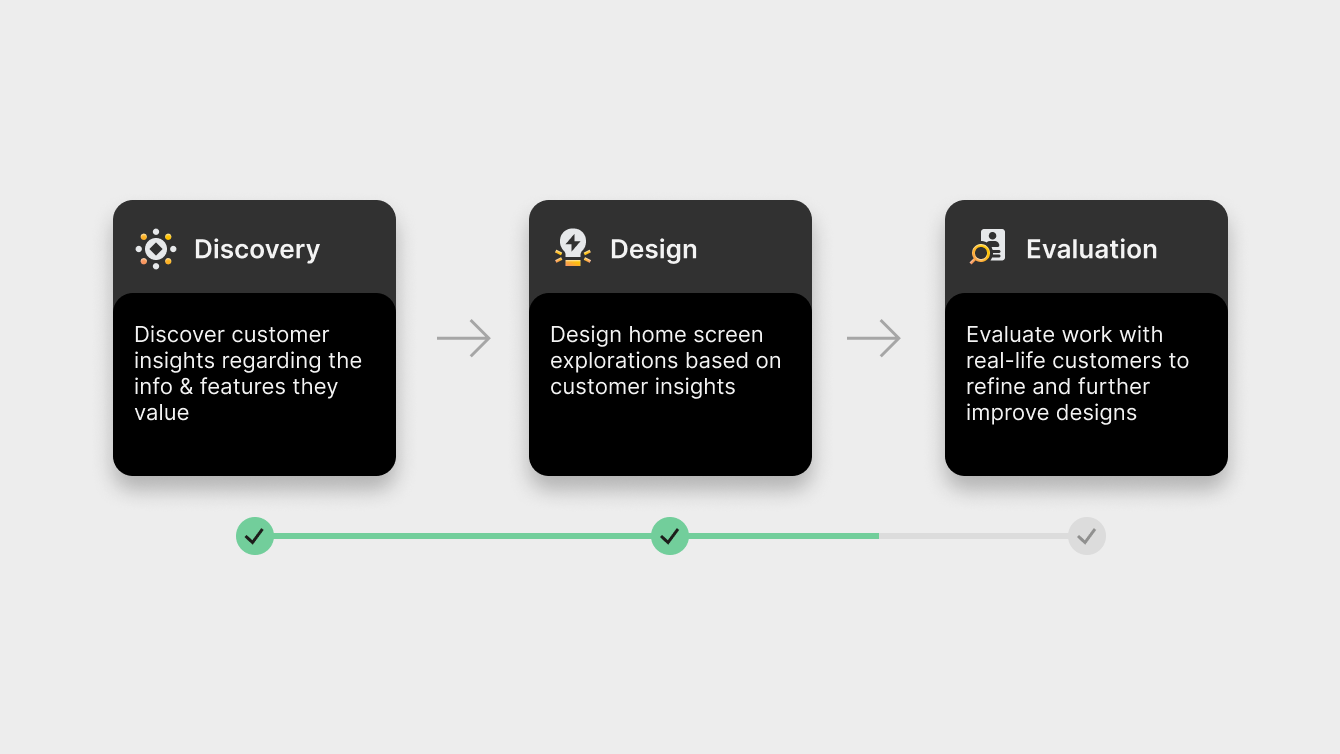
A case (study) of customer-centric design
It’s no hyperbole to say that redesigning an entire mobile app is a herculean undertaking — all told, there were hundreds of unique screens and scenarios we had to account for.
With so many changes to cover, introducing them all at once could be overwhelming for customers. To make the transition smoother, we opted for a phased rollout of the redesign, starting with the most frequently used pages, like our home screen. Let’s dive in.
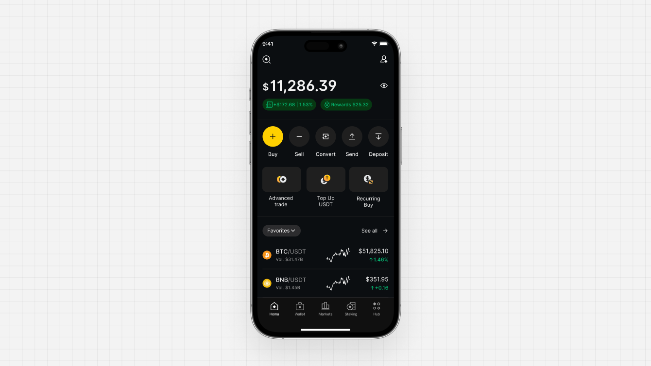
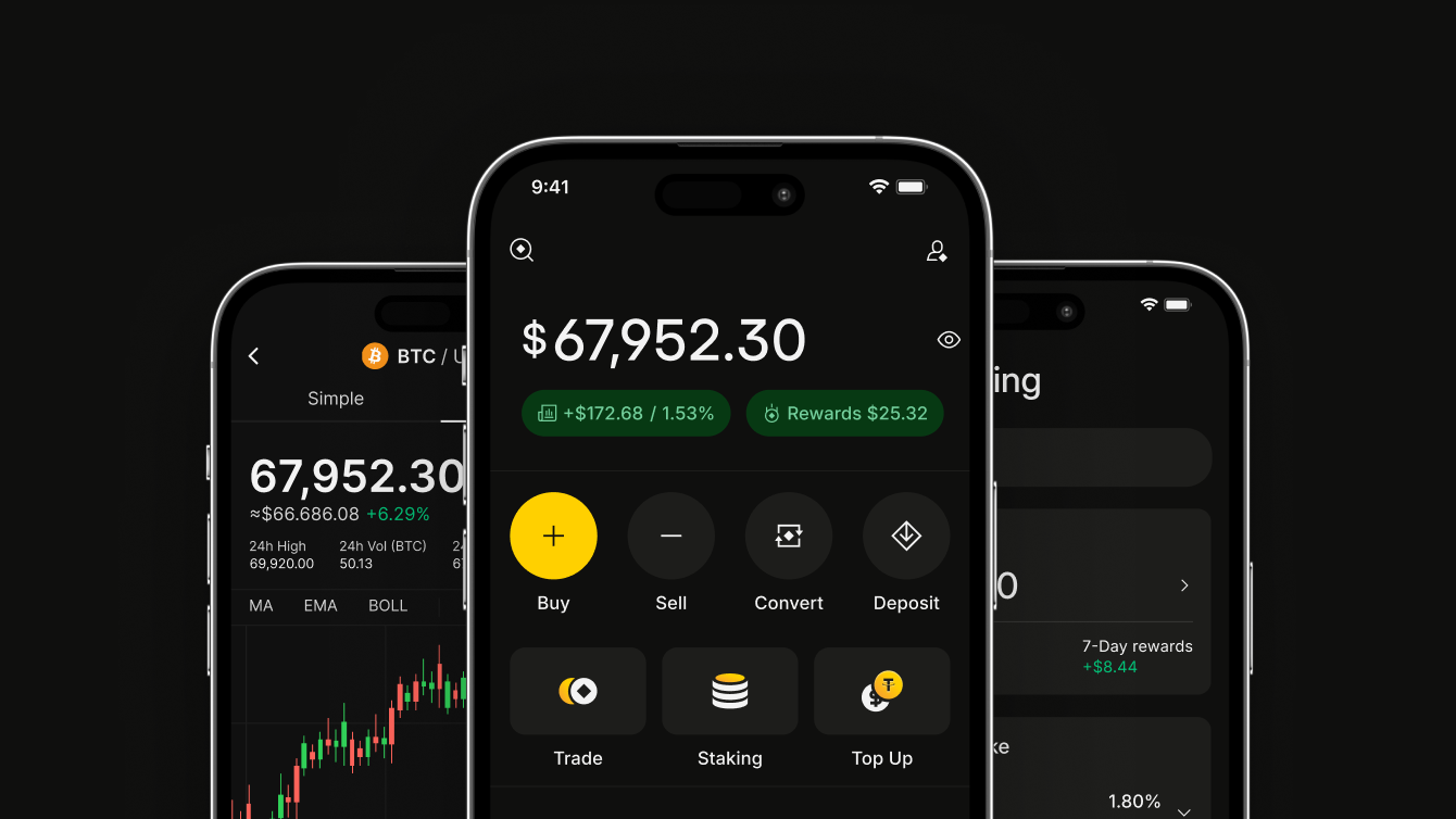
When you open the latest version of the Binance.US app, you’ll see a brand new home screen that brings the features you need to your fingertips. You can quickly buy, trade, and stake crypto, preview live charts and prices, search for 150+ cryptocurrencies, and more. It’s all more immediate and engaging, to give you greater control over your crypto.
"Our initial design explorations revealed an opportunity to more powerfully integrate the Binance.US diamond mark into our brand identity," said Stanislav Aristov, Senior Product Designer. "As a core element of our brand DNA, you'll now see playful references to the diamond throughout our design language—from icons and illustrations to page animations and beyond." We wanted to provide a premium experience that delivers value. But what exactly does premium mean? There are things you’ll immediately notice, like the slick performance dashboard that heroes your crypto portfolio. Then there’s the feel of using the app, which can’t be conveyed as easily over text.
These are aspects that are best experienced firsthand — subtle flourishes like refined animations and navigation transitions that contribute to an experience that’s immersive and immediately intuitive, punctuated only by moments of delight.
It’s always daunting to present your work, but no design is final until it's validated through feedback. We presented several design explorations of the home screen and other pages to customers and invited further rounds of feedback, which sparked yet more design iterations.
All told, more than four out of five customers preferred to use the updated home screen, which we continued to refine until we arrived at the version you see today.
While this may seem like a lot of work for a few screens, pages like the home screen serve as a working canvas for a new design language to take shape. Look closely, and you'll see subtle but important changes that will resonate throughout the mobile experience. In future app updates, you'll see these changes integrated seamlessly across the entire Binance.US app.
Say hello to Facet, Binance.US’ new design system
Driving the redesign is our all-powerful design system called “Facet”, a nod to our brand’s signature diamond-inspired logo. “Think of it as a well-organized toolkit full of resources and components, each with its own set of instructions,” said Leo Arten, our Product Design Manager. “Collectively, these components help streamline the creation of a more consistent and cohesive Binance.US product and brand experience.”
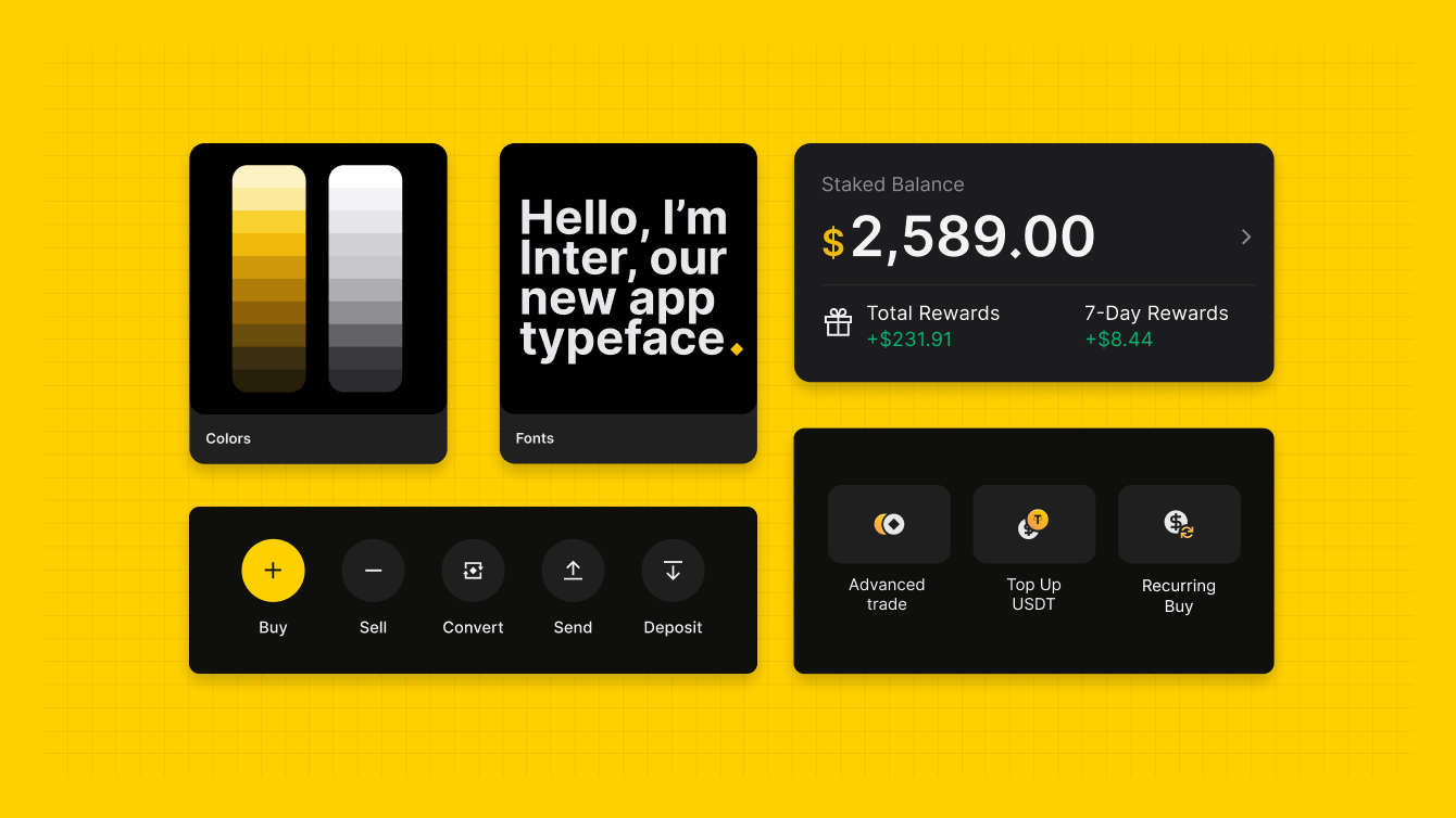
Our new Facet design system includes things like a new library of icons and illustrations, reusable components such as buttons and navigation elements, and the like. This eliminates the need to reinvent the wheel for every project. Instead, designers can simply walk into the design system “library” and grab the tools they need.
A brief (Inter)mission
By the way, as we built Facet, we also updated some core aspects of our brand. You might notice that our signature yellow looks brighter and more exuberant — just like our outlook for crypto.
We also introduced Inter as our new app typeface. Designed for digital experiences, Inter’s clear letterforms ensure optimal readability across different screen sizes and resolutions, which matched our accessibility principles.
While we’re on the topic of fonts and words, we also built clearer and more consistent standards for how we communicate with customers. “We reinforced alignment between product design and content design, to ensure on-screen visuals and copy worked in tandem to better guide customers as they explored our product,” said Daniel Assab, Product Communications Manager. You’ll notice clearer and helpful error messages, alongside instructions that guide you through products you’re using for the first time. The tooltips that greet you when you first open the updated Binance.US app? Those were written by Daniel. Thanks!
Built for speed
With Facet in place, we saw immediate improvements to speed and efficiency, for both design and engineering. “With system components in place, we were able to minimize repetitive design work while improving UX consistency across different screens and journeys,” said Johanne Chow, Product Designer. “Complex journeys that once took a week to design could now be completed in 48 hours or less.”
On the technical side, our engineers worked to define each component in code, so one-off design elements that previously required custom coding could now be turned into reusable components.
For example, the design system standardize elements such as popups, buttons, icons, and common screens, replacing numerous variations with single, consistent versions. This ensures users encounter a familiar and predictable interface when confirming actions in-app, whether it's confirming an order, responding to a popup, or using buttons and other elements.
Furthermore, Facet introduced a streamlined library of colors and font sizes, alongside spacing and padding rules, which enabled our engineering teams to achieve greater consistency and symmetry from design to code.
“With the design system in place, we’ve transitioned from mostly custom-coded elements to a component-based system, which improves consistency, reduces QA time, and ultimately delivers a more cohesive and intuitive user experience,” said Viktor Mizev, Senior Software Engineer. “Facet not only helps us build faster — it also brings design and engineering into closer alignment. What used to be a traditional handoff process now feels like a truly collaborative workflow.”
Tap tap, new app
As the redesigned Binance.US app rolls out to more customers across the U.S., we invite you to download the latest version of the Binance.US app and share your feedback with us. Crucially, we’d love to know what we got right, what we can do better on, and what we should consider for the next app update. We even created a handy survey that you can access directly from the new home screen.
Oh, and one last reminder: the full redesign will roll out incrementally over the next few months, so keep an eye out for even more exciting app updates coming soon.
That’s it from us — happy exploring! 👋
Download the Binance.US app to trade on the go: iOS | Android
Legal disclaimer: This material has been prepared for general informational purposes only and should NOT be: (1) considered an individualized recommendation or advice; and (2) relied upon for any investment activities. All information is provided on an as-is basis and is subject to change without notice, we make no representation or warranty of any kind, express or implied, regarding the accuracy, validity, reliability, availability or completeness of any such information. Binance.US does NOT provide investment, legal, or tax advice in any manner or form. The ownership of any investment decision(s) exclusively vests with you after analyzing all possible risk factors and by exercising your own independent discretion. Binance.US shall not be liable for any consequences thereof.
Risk warning: Buying, selling, and holding cryptocurrencies are activities that are subject to high market risk. The volatile and unpredictable nature of the price of cryptocurrencies may result in a significant loss. Binance.US is not responsible for any loss that you may incur from price fluctuations when you buy, sell, or hold cryptocurrencies. Please refer to our Terms of Use for more information.